

Richfeel.com Website Conversion Rate Optimisation
Baclinc helped Richfeel improve conversion performance on richfeel.com through user journey analysis, page restructuring and clearer paths to consultation booking.
- Client
- Confidential
- Year
- 2026
- Timeline
- 15 Days
- Built on
- Shopify
About the client
Richfeel is a direct to consumer brand operating in the personal care category, with a product range spanning haircare and skincare. Its portfolio is built around trichology and dermatology led formulations, sold to Indian consumers who shop online for solutions to specific hair and skin concerns rather than general cosmetic products. The brand reaches these customers primarily through its own website, Richfeel.com, where product discovery, education and purchase all take place in the same journey. As a result, the site carries the full weight of the brand's retail performance, from first visit through to checkout.
The challenge
Richfeel came to Baclinc with a website that was attracting visitors but converting very few of them into consultation bookings. The pages carried limited information about treatments, outcomes and clinical credibility, leaving prospective patients without the reassurance they needed before committing to a paid appointment. For a hair care and trichology brand where the decision to book is considered and often researched at length, this gap sat directly between marketing spend and revenue. Every visitor who left without enquiring represented acquisition cost the business had already paid for, with no commercial return to show for it.
The solution
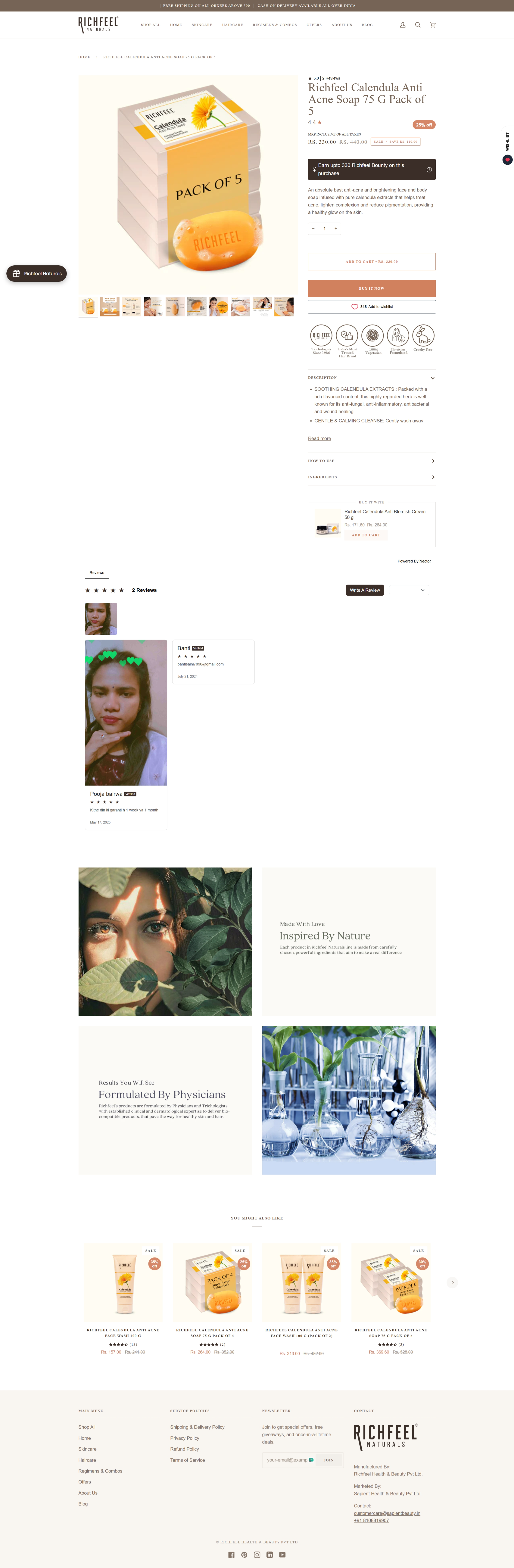
Baclinc audited the existing Richfeel.com journey from landing page to appointment enquiry, mapping where visitors dropped off before booking a consultation. Based on that audit, the team restructured page layouts to bring treatment information, credibility signals and the enquiry form into clearer view, and rebuilt the booking form to reduce the number of fields a visitor had to complete. Clinic location and specialisation pages were reworked so that users arriving from search landed on content matched to their intent rather than a generic overview, and calls to action were made consistent across templates. Page load performance and mobile rendering were addressed in the same build, since a large share of enquiry traffic came from handsets where slower loading was interrupting form completion. This approach was chosen because the site already attracted relevant demand, so the priority was removing friction in the path to enquiry rather than redesigning the brand presence.

Ready to scale your business?
Let's discuss how we can help you achieve similar results with our data-driven approach.
Start a Project